
Year 8 Frequency Diagrams Worksheets | Printable PDFs
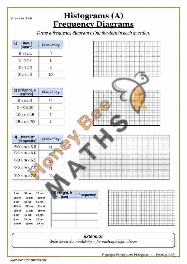
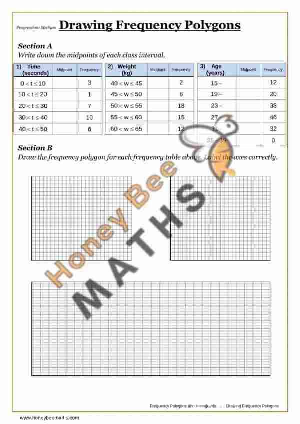
Year 8 Frequency Diagrams worksheets for Year 8 Maths (Key Stage 3). Students aged 12–13 learn to interpret, draw and analyse frequency diagrams and frequency polygons. A frequency diagram is a graph that shows how often values occur in a data set. A frequency polygon is a graph made by joining the midpoints of the tops of bars on a frequency diagram with straight lines.
Students also practise constructing frequency polygons from grouped data. For questions on Pie Charts see Year 8 Pie Charts Worksheets, or for easier charts try Year 7 Charts Worksheets.
Common Questions about Year 8 Frequency Diagrams
What is a frequency diagram?
A frequency diagram displays data visually, showing how often different values or groups occur.What is a frequency polygon?
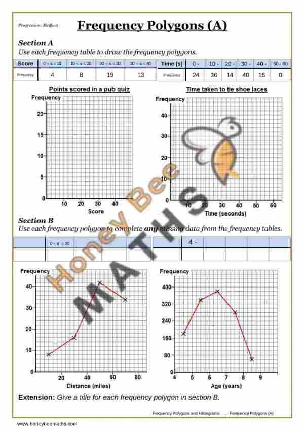
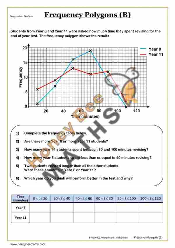
A frequency polygon is a graph created by plotting frequencies against class midpoints and joining the points with straight lines.Why are frequency diagrams useful?
They help identify patterns, compare distributions and spot trends in data more easily.
Year 8 Frequency Diagrams Common Mistakes
Common Mistake 1
Plotting frequencies at class boundaries instead of class midpoints.Common Mistake 2
Joining the points incorrectly on a frequency polygon.Common Mistake 3
Reading values from the graph without checking the scale carefully.
Frequency Diagrams Worksheets - Free Worksheets Above

Frequency Polygons (A)

Frequency Polygons (B)

Frequency Diagrams